Turning Heads with Graphics that “Wow!”
Compelling a reaction with graphics is no small feat. Accomplishing it can pay dividends. So I thought I would explore some examples we at Carvertise have helped put on the road, and elaborate a bit on what can make a captured audience say “Wow!”
Flight of Fancy 
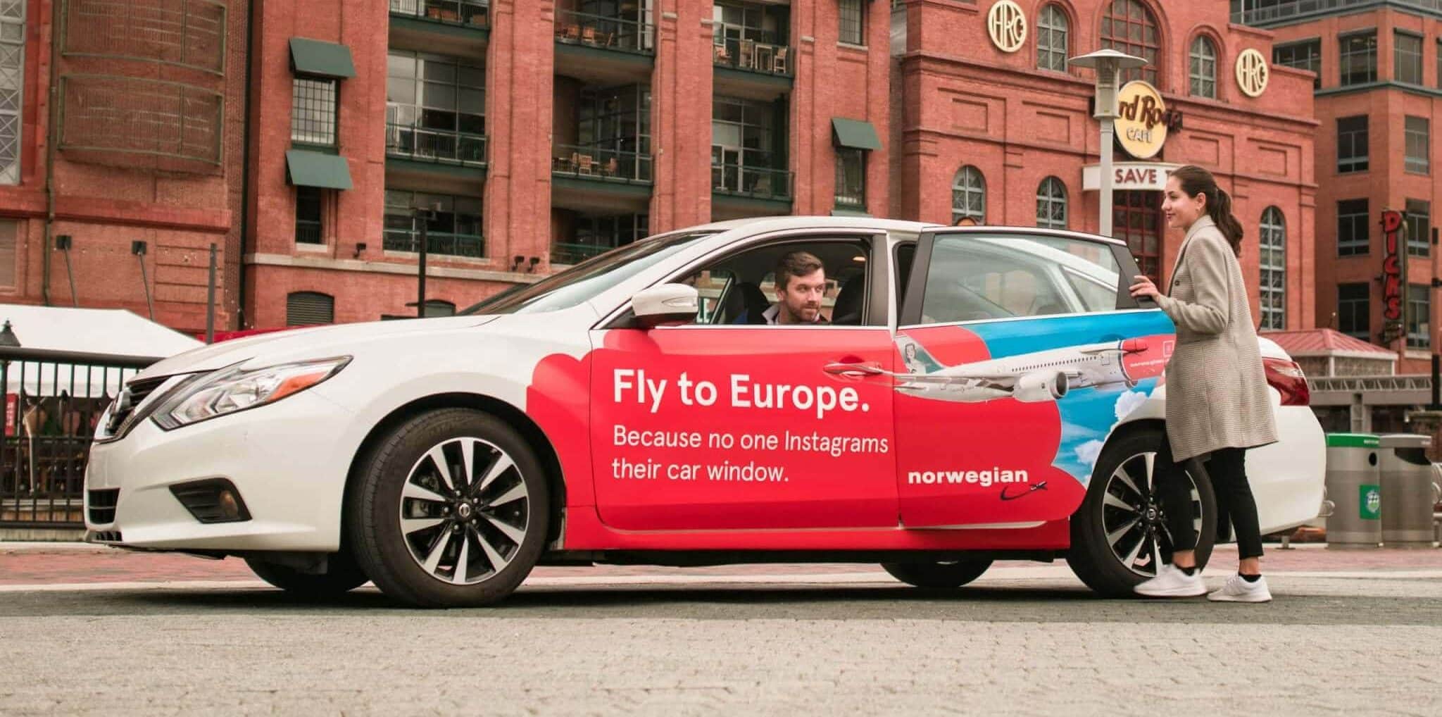
A creative approach to our form of out-of-home advertising and a clever way of catching attention is using imagery you may not normally find at ground-level. So when Norwegian Air came to us with their design, we were… well floored! The bright red of their branding in contrast with the stark blue sky already successfully catches the eye. The clever use of one of their planes breaking across the red cloud and flying into the blue sky creates a dynamic visual. A moment of flight captured and suspended on the side of the car adds a level of ‘cool’ to the graphic. The dual sense of a “getaway” really makes this clean, successful advertisement.
Dramatic Performance
Ever get the feeling someone is looking at you? Of course you have, but has an advertisement ever triggered that response for you? Cirque Du Soleil’s wrap certainly accomplished that! The world-renowned circus showed exactly what they’re known for with this advertisement. 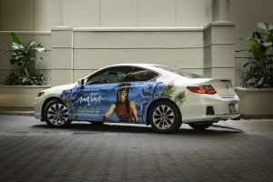 Wonderfully energetic, colorful, and often dramatic shows, played out by their talented and intense performers, is put on full display on this wrap. The “Wow!” and “Whoa!” responses to this advertisement were always similarly energetic.
Money Talks
Everyone likes a little more green in their pockets, something Carvertise is a huge proponent of. So when DraftKings came to us looking to expand their advertising campaign, we were delighted to see what they had come up with. 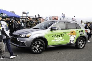 This is a great example of an advertisement doing something visually out of the ordinary, multiplying its ability to capture attention. The bright green pops and catches your eye as soon as it comes into sight. Then you see 5-dollar-bill Abe Lincoln sporting a bright orange hat and headphones and he’s immediately the coolest guy in the crowd. This bright and to-the-point design turned heads everywhere it went.
A Different Ride
We’ve all had a “double-take” moment, where we have to look twice at something to make sure we’re seeing things correctly. Dutchess County Tourism’s advertising campaign did a fantastic job of this by utilizing our product in a special way. Which car is real?!  Lining up just right with the driver’s car, utilizing the sheen of the materials, we get a vision of what FDR looked like in his Lincoln Model-K. Designing the advertisement to take advantage of this canvas is one of the many advantages to this medium. This clever use of the wrap was an immediate head-turner.
Make a Splash
Our eyes are drawn to movement and action even more so when bright colors are in involved. When an advertisement like Ricciardi’s comes along and combines those aspects with a solid and clear message, the results are mesmerizing. The bright blue paint splashing down the car as if actually spilled is a brilliant use of a concept that resonates with everyone. 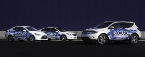 The easily legible branding and messaging communicates clearly to those now captured by the ad’s imagery. This remains one of my favorite wraps we’ve done to date. The movement and color are so vibrant, the design so dynamic, that it still catches my attention. I can’t help but put it up on a pedestal for ‘cool’ and ‘wow!’